Press & partners
Brand kit
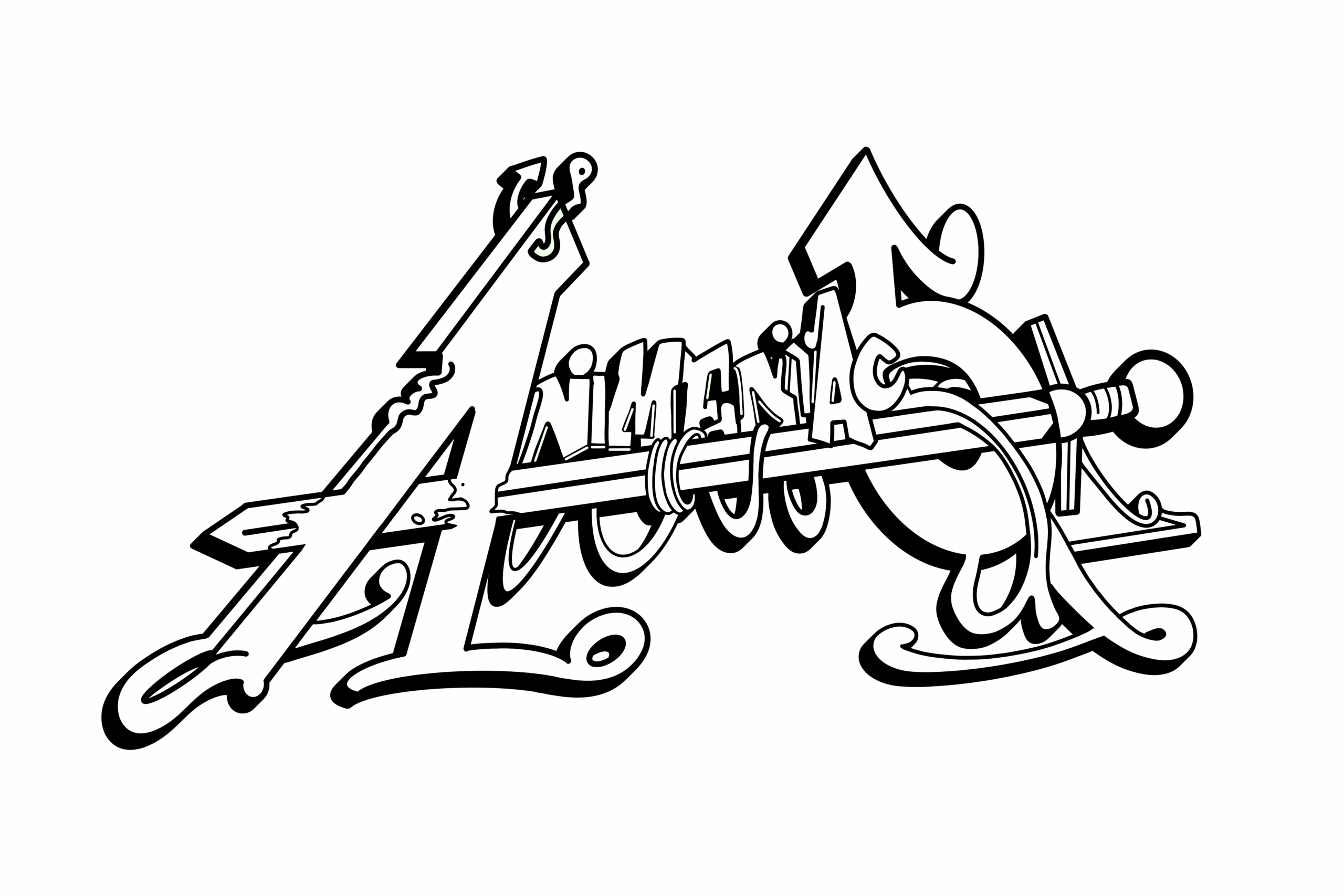
Repping Animeniacs in a post, a feature, or a collab? Right on. Grab the logos below and keep it looking clean with the quick guidelines — colors, type, and a few do's and don'ts.
The mark
Our logo
Keep it clean
Logo usage
Do
- Give the logo breathing room — keep clear space around it.
- White mark on dark, black mark on light.
- Keep neon green for accents only — never large fills.
- Scale it proportionally so the details stay crisp.
Don't
- Stretch, squish, or rotate the mark.
- Recolor it outside the palette below.
- Add drop shadows, outlines, or extra effects.
- Drop it on a busy background that kills legibility.
The palette
Colors
Purple carries the brand; neon green is the spray-paint accent — CTAs, highlights, never big fills.
Ink
#0D0A14
Backgrounds
Wall
#1A0F2E
Cards & surfaces
Brand purple
#8B3DFF
Primary brand
Soft purple
#C4A5FF
Secondary accents
Neon green
#39FF14
Accent only
Bone
#F3EEFF
Text on dark
The type
Typography
Fandom at its best
Bebas Neue
Display & headlines
Anime art, gaming gear, custom pieces.
Space Grotesk
Body & interface
New drops weekly
Space Mono
Labels & HUD
The voice
How we sound
We're a scrappy crew — fandom at its best. Talk like a friend who's deep in the culture: hyped, inclusive, a little irreverent, never corporate. Celebrate the fans and the artists first.
Credit us
Tag @animeniacs.shop and link animeniacs.shop so folks can find the crew.
Doing a feature or collab?
Need something custom — a vector, a specific format, a quote? Reach out.